Progor
Members-
Posts
28 -
Joined
-
Last visited
Reputation
39 ExcellentRecent Profile Visitors
The recent visitors block is disabled and is not being shown to other users.
-
I started trying to parse boostsets as well, and found an awesome tool to help: https://ide.kaitai.io/# part of the https://kaitai.io/ kaitai-struct project. It gives you a DSL made specifically for parsing binary files, and more importantly, an IDE that highlights the section of the binary file that each parse covers. Once you've got the file defined in their simple YAML format, it generates code in a bunch of languages to do the actual parsing. The only difficulty is the parser output is pretty verbose, mentioning every array size, string length, and offset pointer you had to use to define the file. I fixed this by naming the important variable at each level "value" and replacing the parent object with the value field whenever I see it. I've got boostsets and attrib_names (wanted to start with something easy to evaluate the tool) in a new project: https://github.com/dpwhittaker/coh-parse7 With the following "API" available so far: https://dpwhittaker.github.io/coh-parse7/boostSets.json https://dpwhittaker.github.io/coh-parse7/attribNames.json I'll probably do client messages in this format next, then try to tackle powers to see if it ends up being even more straightforward than the rust implementation. The easier it is to find and fix format changes after a release, the faster tools that rely on it can get updated.
-
At least the recursion depth is limited by the size of the file, or I may have never emerged from the abyss!
-
There's also some additional files that I don't think any of the projects have parsed yet. One is boostsets.bin. I may try to reverse engineer that one myself based on ourodev code, but I don't have access to homecoming code, so I'm at a disadvantage. I'm not sure what information it will or won't provide.
-
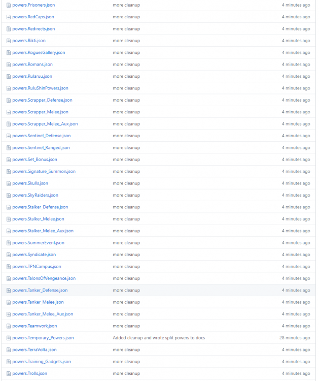
Alright, I went ahead and did the defaults and split into categories. This made all the files around 1MB or less (a few big ones up to 5MB), which is much more doable for a web app that's pulling in around 5-10 files to get the primary, secondary, pools, boosts, and pets for a single build. If you're going to do much more than this you probably just want to load the 41MB powers.json with everything in it, including the powers possessed by Hellions in the Sewer trial. Maybe I'll make a powers.Player.json that has everything accessible to a player. There's also the powers.default.json. This file has the default values for any value that shows up in more than 20% of the powers. At each level of this object, the "sub" field represents the defaults of the object contained in that field. For instance: sub.effects.tag tells you the default value that should go in effects: [ { tag: ...} ]. This structure is more deeply nested than I thought (effects can have effects of their own), so I used a recursive function to find the defaults, and you'll probably need one to rebuild the original object from the defaults if you want to. Here's a shot of the files that are output (197 total). Feel free to look around in the github project, or you can access them API-style like this: https://dpwhittaker.github.io/sif_parser/powers/Tanker_Melee.json I'll work on the archetypes and powersets next to act as an index into these files. I'll probably end up adding some folder structure here, so don't start building anything on this yet 🙂 edit: removed the powers. prefix and moved them into a powers folder.
-
Yep, noticed that. So, got that figured out and made the first early, hard-coded, cobbled-together, command-line app. https://github.com/dpwhittaker/sif_parser Just "cargo run" it with bin.pigg and bin_powers.pigg in the parent directory to generate a powers.json in the parent directory. and here's the output for the powers.bin: https://1drv.ms/u/s!AuGvcX8-qHq2luNtIXUr_nVnmKheqA?e=nMZT8N So, next steps are: output the other bins as json come up with a "default value" for each field and only serialize the field if it is different from the default to cut down on file size. 242MB uncompressed is a bit much for a web app split it up into categories similar @RubyRed's API This post-processing will probably happen in a language I'm more comfortable with - Node or Python. In any case, this should get it down to something that fits comfortably in github pages limits, so I'll publish it there as a "static API" similar to RubyRed's.
-
I think there's value here as well as @RubyRed's API. This library can give you *all* the raw data, while RubyRed's API focuses on giving you the important bits for building tools without all the extras. I'll work on a command line application for exporting the results as JSON so it can be just as accessible from downstream apps. @Sif Alright, quick usage check. I don't know rust well enough to write correct syntax yet, but here's what it looks like I need to do to load powers data and write it out as json: let pigg = Pigg::new("path/to/file.pigg"); let messages = parse_messages::get_pmessages(pigg.get_data("bin/clientmessages-en.bin")); let powers = defs::decode<objects::Power>(pigg.get_data("bin/powers.bin")); foreach (power in powers) power.fix_strings(messages); writeFile("powers.json", serde_json::to_string(powers)); Does that look about right (other than slaughtering the syntax, I'm sure), or am I missing something?
-
Reposting @Sif's work here so we don't take over @The Philotic Knight's thread: GitHub (source): https://github.com/IndexObscurum/index_datamanip Crates.io (Rust package): https://crates.io/crates/index_datamanip Docs.rs (docs): https://docs.rs/index_datamanip/ This contains the code for extracting data from Piggs, enough handling around MessageStores to go from the P-strings to localized text (the rest of the data is parsed, but discarded currently), and for deserializing Parse7-encoded bins into the passed in data structures. Additionally, it contains all of the structures (in the objects module) used for deserializing Powers/Powerset/PowerCategories/Classes (Classes has something like 2 fields unimplemented). I have some additional high level documentation on the formats I've written up that I intend to merge into the library's docs. Some work would need to be done to make this a CLI / callable from non-Rust languages (I have some ideas for both, but... I also rolled a new Blaster...)
-
A Powers "API" of sorts (Gift to the community developers)
Progor replied to RubyRed's topic in Tools, Utilities & Downloads
@RubyRed I was about to start working on what @Sif suggested using his library to create something like what you just did... but you've already done it, plus calculated scales, so I'll work with yours for now. Thank you both for your efforts! Two things I notice missing from the API that is useful for planner-like things are Pets (how much does the burn patch do over time? How much does a Protector Bot bubble for?) and Boosts (Enhancements). I'll add those power categories and see what comes out in the parse locally, but we may need to end up parsing boostsets.bin to get all the info necessary. -
Yeah, that's why they stopped calling themselves UI (user interface) designers and started calling themselves UX (user experience) designers. It's as much about having a streamlined flow through the application as it is about looking pretty. We talked this afternoon and the first thing we worked out was user flow diagrams, not artistic concepts, so he's on the same page. "intuitive and easy to use" is often harder than people realize to get right. I can handle making the application do what it needs to do correctly and consistently, but having a UX expert will help achieve that zen-like flow where every button you want to tap just happens to be right under your thumb when you need to tap it.
-
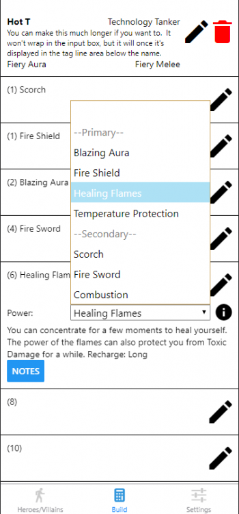
Quick update: power selection is started. I still need to filter out powers you've already selected from the dropdown list so you can't duplicate, and add the pool powers, but it's coming along. It follows the same basic design for the Heroes screen: click the pencil to modify the power, select from a dropdown, click the info button if you want details. I'm even retaining a per-power notes box if people want to use it. Let me know if anyone wants to see a Tag Line on the powers as well. Another note: a generous forum-goer who happens to be a UX designer by day (I'll let them pipe in and identify themselves if they wish) has offered to help with the look and feel, so once he gets a chance to send me some sketches and I get them integrated, it should start looking nicer. The empty space below the power name will be filled with the slotted enhancements, and perhaps some basic effect details.
-
I can actually do one better on the first request - you could import a /buildsave file and it could compare which enhancements you have equipped to the ones in your build and highlight them. I could also add a manual checkbox to allow you to mark the ones in your inventory that have not been slotted. A "shopping list" report sounds like the next request, which would list out the enhancements you are currently missing, probably sorted by rarity and/or expected cost. Do you have a link to the slash commands on test server? That sounds pretty straightforward as well.
-
If a moderator wants to move it, that's fine. Otherwise I'll start a new topic there when I get to the alpha release.
-
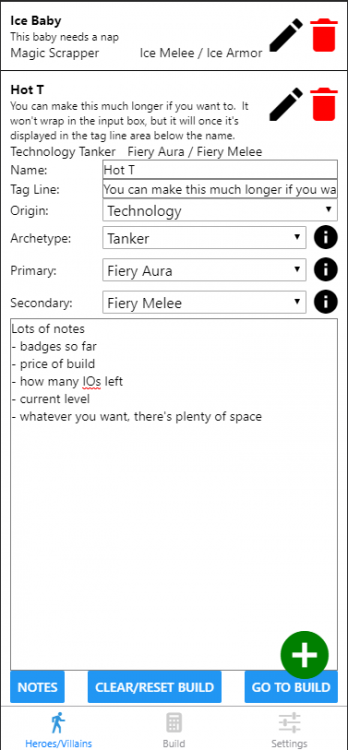
Think this will cover your needs? The notes box at the bottom is not visible until you toggle it with the Notes button. It's 20 lines long and will scroll if you need more, so you can write a small novel in there if you want. The Tag Line shows up as small text below the name, and can technically be pretty much as long as you want as well, but it will blow up your hero list if it's too long, so I'd keep it short. If there's nothing there it takes up no space at all. Depending on the size of your phone, the entire "card" for a single hero may not fit on your screen, but scrolling up and down shouldn't be an issue. If you have a larger phone, it fits fine (this size simulates an iPhone X, for reference).
-
Yeah, notes would be easy to add. It's more a matter of screen real estate vs. general utility. So I'll hide the notes behind a button click, then give you a big multiline textbox you can put anything you want in. I could also add a 1-line "Tag Line" under the name that would show up in the collapsed view as well if you wanted some custom text visible from the "hero tracker".
-
Progor started following Online/Mobile Planner
-
Progress is being made: This is the blander "SFW" theme. If there's still too much color, let me know. I'll spice it up a bit after the basic functionality is working. Incidentally, if anyone has UX design experience, I'd love some input on what that should look like 🙂 Otherwise I'll mostly just round off some corners, add more color and more icons from the game, and have a blue hero and red villain theme, each on black or white background. So I'm working on ways to show you just as much information as you want without without cramming your tiny screen full of size 1 font. This is the Hero/Villain creation tab, that lets you create your stable of heroes and select their origin, archetype, primary and secondary. Once you've done that, you can click the Go To Build button, which will take you to the build tab to start adding powers and slots. Notice that there are 3 different levels of "expansion" here - the "Ice Baby" build is fully collapsed, showing just the basic information to remind you which build it is. On the right are edit and delete icons (don't worry, the delete shows a confirmation before actually deleting). when you click the edit pencil icon, it expands to look like "Hot T", and give you the option to alter the name, origin, archetype, and power sets. Altering the Archetype, Primary, or Secondary would mess up the build, so they will probably be grayed out after you add the first power unless you click the Clear/Reset build button. Finally, if you want more information about the archetype or power sets you are selecting, you can click the info icon to expand out the description of the archetype or power set. The plus at the bottom lets you add new characters. When you go to the build tab, you'll see the same block at the top (fully collapsed). This should make it easy when you are first creating a build to switch between power sets and look at the powers until you decide on one you like. The build tab will have the same basic flow. No plus icon, since it will be pre-populated with the 24 power slots, all empty. Click the edit pencil on one, select from a dropdown of powers available at that level. Info icons everywhere will give you the textual description of whatever you've selected. Another icon will let you drill down to the numbers. Click the edit pencil again to collapse everything down to just the level, name of the power, and enhancements slotted. For enhancements, I'm still thinking through what the interaction should look like. I know I want it to be more set-based than Mids' - it shouldn't take 50 clicks to change 6 SOs to a full set of IOs. That should be three actions: clear enhancements from power -> select set -> click select all. To handle frankenslotting, each enhancement in the set should also be able to be selected individually. As long as you haven't filled all 6 slots, then additional set selection dropdowns will be shown. TOs, DOs, SOs, IOs, and Hamis will just show up as additional sets, only instead of checking off the enhancement, you'll be able to select a number between 1 and 6 (through slider, spinner, 6 checkboxes, or just repeatedly clicking the enhancement, I'm not sure). Notice I didn't mention "adding slots" anywhere - I'm not trying to be faithful to the in-game experience like Mids' does. If you add an enhancement it automatically adds the slot. Once you've added 67 enhancements (other than the first in each power), you can't add any more enhancements. Either way, I'll put more screenshots up as I get more built. Hoping to have the first prototype ready for alpha testing this weekend (probably without any sort of totals calculation, just picking powers and enhancements). Let me know what you think.


