

A.I.D.A.
-
Posts
303 -
Joined
-
Last visited
Content Type
Profiles
Forums
Events
Store
Articles
Patch Notes
Posts posted by A.I.D.A.
-
-
Shadow Shard skybox on any map. That'd be neat.
-
Ice Patch already knocks everything down. I'm glad with throwing a basic recharge IO in there (my end management is usually plenty fine enough that I'd rather have more ice patches than cheaper ones). Not every power needs game-changing slotting possibilities. It's okay to have a few one-slot wonders.
-
 2
2
-
 2
2
-
-
There's the Lost cure wand prop from that one mission arc. It's kind of a silver rod with a crystal on top.
-
 1
1
-
-
I think only the Circle's archers are sometimes women. 95% of the time, the Circle of Thorns is all men, demons, ghosts and hordelings.
-
If a zone has a base portal, you're always only a short jaunt and a /enterbasefrompasscode "ZONE-8888" away from a trainer.
-
On 7/19/2021 at 12:20 PM, Shenanigunner said:
...until your framerate in, say, Atlas Plaza crashes to single digits trying to manage 16M colors for all the clotheshorses. 🙂
I have no objection to the suggestion, but even as a designer I don't find myself limited by the current color options and I wouldn't want to trade game performance for more fun in costume creator. (I also note that there's often only a loose correlation between the color patch and the result; I often have to use three or four different swatches to get an all-matching result.)
If there's no performance hit, I have no objections at all.
If colour count in textures tanks your framerate, you need a new PC.
-
1 hour ago, kelika2 said:
dmg slotted bonfire
lel
-
1
-
-
You're allowed to post whatever drivel sort of suggestion you want here. Conversely, everyone else on this forum is allowed to post what they think about your suggestion. It really isn't hard, you just have some really bad ideas and a habit of doubling down on them when the idea is called out, and pretending people are personally attacking you when in reality, you just had a shitty idea. This forum is called "Suggestions & Feedback." If you just want to leave a suggestion and not receive any feedback on it, try looking for the "Suggestions Without Feedback" forum-- oh wait, there isn't one.
-
On 10/9/2023 at 5:25 PM, kelika2 said:
Because even after you found out A Why from someone else you were still overwhelmingly negative.
Because it's a shitty idea.
-
My ice melee character is a stalker, and since I hate the way the ice-block punches look, she's all ice swords, all the time, plus the frozen touch that does a DoT and hold, and Frost and Frozen Aura for AoE. I did end up taking Ice Patch later than I maybe should have, but that's because the info regarding its knockdown proc rate in Mids was misleading -- it actually knocks almost everyone down all the time, instead of Mids' incorrect 8% chance per second. Still never had a problem with my attack chain. Sure, I had to fill it in with Apprentice Charm and Arcane Bolt at low levels, but so does literally everyone with a secondary full of toggles. Fluid attack chains come with global recharge in later build states.
-
1
-
-
Yep. They were badly designed by Cryptic back in the day and so we're stuck with them.
-
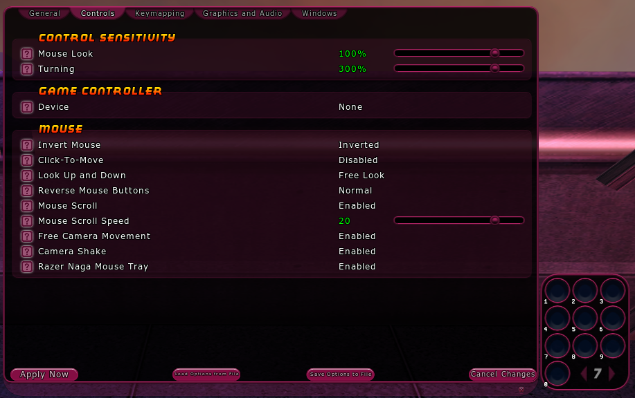
Anyway, back to the actual content of the thread now! The funny thing is that there actually is a Naga tray in Options -> Controls:

. . . and as you can see, it still has that little 10th button, making it asymmetrical with the stack of three bars you can expand the main tray to. That asymmetry, coupled with the fact that I only use buttons 1~5 because 6 is unwieldy to press from WASD position, is the reason I don't personally use it, and elected to put the 3x3 Naga cluster in slots 8~0 on the main bar instead. The 6's and 7's aren't even bound to anything, they're just dead space that I would love to completely remove if I could. In a competently designed UI, I would be able to shrink bars to 5 buttons in size, arrange the grids of the bars with two or more rows as I like them, and remove the background of the bar's 'window' so that it only shows the buttons, or even hide buttons without a power slotted into them (briefly showing the empty buttons while a dragged power is on the mouse for placement purposes). But as we all know, back in the day, Cryptic did not really have very many competent designers, and it's their code we're saddled with today. CoH was, after all, under the "care" of Jack "Players Don't Need To See Damage Floaters" Emmert for far too much of its lifespan.
-
Downtime is when you're not fighting. Gameplay is when you're fighting. Anyway, I'm actually blocking you this time, to preempt another utter bullshit-fest like your behaviour in that other thread, Rudra.
-
That's not 'during gameplay,' that's 'during downtime, and once at the beginning of gameplay.' Two extra mouse clicks for the one person who uses the GUI selector at all outside of initial setup is a small price to pay for the screenspace it saves every single player on the server.
You can also just give your travel powers binds of their own. Personally, I dedicate toggled travel powers to V and Shift+V, while I tend to use CTRL+LBUTTON for teleport.
Here's a snippet of my bind file for a character that uses both, actually:
V "powexec_name Mystic Flight"
SHIFT+V "powexec_name Hover"
CTRL+LBUTTON "powexec_name Translocation"
I still drag the flying ones up to one of my top bars so that I can see which flight powers are toggled on, but their placement on the hotbar has nothing to do with the button being pressed to activate them. I'll even do that with some ground target powers I macro to cast at a preferred spot (on me, on my target, etc, depending on the power) -- I might slot it on my bar in a place that's normally activated by Shift+4, but in that character's individual bind file, I'll rebind Shift+4 to a powexec command for it. The icon is just put on the bar so I can see its recharge timer.
-
I've seen plenty of games with those elements sitting just outside of the hotbar, or even optionally hideable. If they must be present and wasting screen space, then splitting them out into a separate UI container from the bar wouldn't likely have been very difficult -- but it probably would have had to have been done by the exceptionally incompetent Live devs back in the day, because by now that's probably unraveling too much spaghetti code.
As for needing to right-click to do any management, is that such a bad thing? How many people actually page their bars during gameplay, instead of setting them up once and saving the default layout they like, and just dragging powers to the slots when they learn them? I'm willing to bet the number is small enough not to have to worry what they think on the matter.
If someone actually has three pages of powers on a single, 10-slot bar, and manually pages between those pages in a single bar, I don't think I actually want that person on my team anyway. "Sorry I wasted half that fight not activating powers, I was looking through 30 power slots on a 10-slot window . . ."
Ridiculous XD
-
Yep, it has one less scaling resist source than other ATs.
-
3 hours ago, Tailcoat said:
Ok, I see that the weird tray alignment of not being in an even grid was the issue. It's been a while since I played. I wish I could have a power tray of 12 buttons in a grid, but I do like A.I.D.A.'s idea.
I hope it helps. The only reason I didn't make mine 3x4 is because I use buttons 10, 11 and 12 on the Naga for other things outside of the game.
-
There are those flying weapons from Night Ward, I think there's swords and staffs, and maybe axes? I think there's also a crystal ball and a spellbook, but I haven't been there in long enough to remember for sure. Combine those with some of the more formless Living Spell enemies and you could have a neat mastermind primary.
-
3
-
-
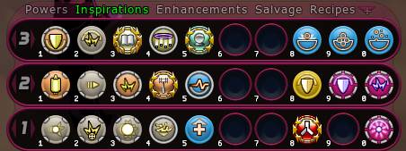
For reference, here is what I ended up doing with my own bars:
That 3x3 side cluster where I put all my toggles, is bound to 3/4ths of my Naga's side buttons.
-
 1
1
-
-
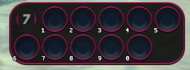
I just wish the 2x6 and 6x2 trays were in alignment with themselves. Here is a 6x2 tray in-game:
Why did they make that second row offset so much, back in Live? Move that bottom row exactly one button's worth to the right, call it a 5x2 instead, and then it'd be golden. But what we actually have here is a 4x2, with two extra little half-columns on either end.
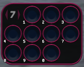
Edit: same with the 3x4's and 4x3's too. These do not actually represent the button layouts of MMO mice:
-
1
-
-
14 hours ago, TheZag said:
The reason was to prevent super reflexes characters from being able to slot all the good resistance uniques.
But you can slot all of them, you just put them in Tough! XD
-
I mean, I don't really think it needs any change at all. I haven't noticed any issues spreading Disintegrate on the Beam Rifle characters I've played (Corruptor, and Sentinel). Groups of melee mobs don't split off from each other either, they run towards you in a blob. I don't really know what you mean by them spreading out. The only way mob groups spread out is if you put a patch underneath them that has a fear component -- enemies will move out of Caltrops rather than stay inside them, etc.
-
+1 for cosmetic options
-
6 hours ago, kelika2 said:
i wanna say that only regen and willpower gave up something significant for Hide. others got stuff rolled into other things.
reflexes lost its auto aoe def because hide does pretty much the same thing
dark lost its something something im not doing the whole secondaries
Reflex loses the auto AoE defense because its value got rolled into the toggle AoE defense on Stalkers.
Auto Power Accepts Recharge Enhancements
in Bug Reports
Posted
I thought you had to defeat a gym leader for that one. XD