Mjolnerd
-
Posts
429 -
Joined
-
Last visited
-
Days Won
9
Content Type
Profiles
Forums
Events
Store
Articles
Patch Notes
Everything posted by Mjolnerd
-
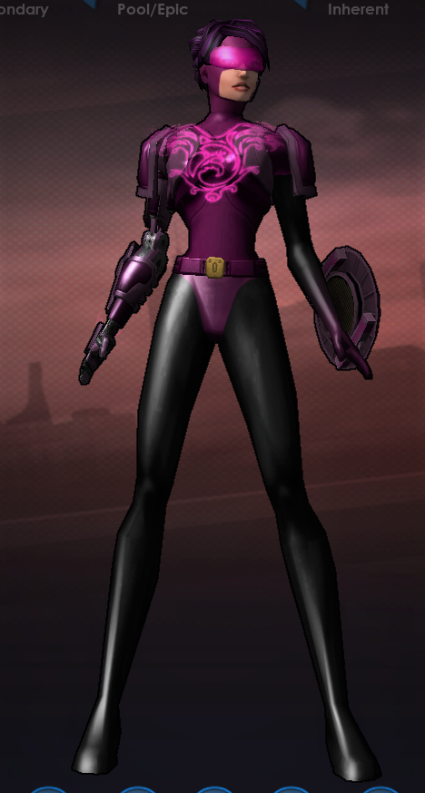
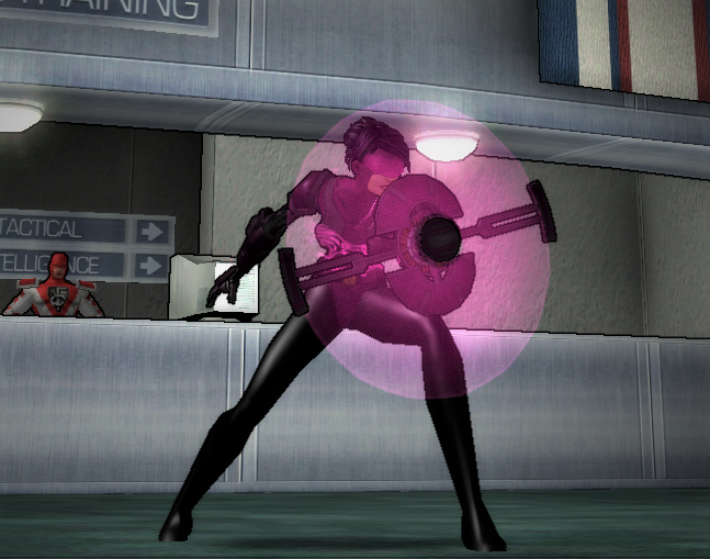
"I designed this costume, but the character needs a name.""I want to play a [primary]/[secondary] [Archetype] but can't think of a good name, can someone help me out?""I had [name] on live but it's taken on Excelsior, does anyone have a decent alternative they're not using?" A discussion in the "Name Release" thread prompted the creation of this one. Think of it as a sort of a companion to that thread -- this is the place to ask for help naming a character on Excelsior. Maybe you're looking for something specific, maybe the one you wanted is taken and you're looking for something else, maybe you're just drawing a blank... the fabled "best MMO community in the world" might be able to help. Obviously, don't suggest names you know to be taken. Ideally, check anything you're going to suggest in-game before posting if you're able. If you're asking someone to give up something they're already in possession of, maybe offering a trade would be nice, too (by which I mean, "offer up another name from your roster," not "offer to pay them a ton of Inf" and especially not "offer them some sort of real-world reward for it" since that's likely a violation of the Terms of Service). I'll start: I designed this character during the Blip, when all we had was the costume editor, and ever since the game came back I've wanted to do something with her. Obviously she's got Shield Defense, but her AT and accompanying attack powerset are kind of up in the air (it's Street Justice right now, but she could easily be remade to use Martial Arts or Psionic Melee or a weapon or who-knows-what). I haven't settled on a background or origin story, though I've always sort of leaned toward "cop from the future" or something similar. At the moment I'm squatting on the name "Vigilant" for her, which I recognize is objectively a very good name, but for whatever reason it isn't clicking with me. I'd be willing to trade that name for a replacement -- something that references the shield and/or protection indirectly would be most appreciated (you know, Guardian or Sentinelle or something), but I'm willing to consider others, especially if they suggest a particular attack power to go with the shield.

-
"I designed this costume, but the character needs a name." "I want to play a [primary]/[secondary] [Archetype] but can't think of a good name, can someone help me out?" "I had [name] on live but it's taken on Excelsior, does anyone know if the person who has it is actually using it?" Yep, I'm all for it.
-
Awesome, glad I could help!
-
Not sure exactly what you're asking for here. People do use this thread to let the community at large know when they drop names so that others can pick them up; it is a central location for that kind of thing. With a thousand slots per server and the ability to create a theoretically infinite number of accounts, people are going to squat on names they like, at least until that name-release policy that was discussed early in the days of Homecoming goes into effect (assuming it ever actually does). It's the nature of the beast, for good or ill. And really, there's nothing stopping people from using this thread, or starting another, to advertise that they're looking for a particular name, or just using /getglobalname and sending an in-game email to the owner to see if they're willing to part with it. I've been on both ends of that personally; sometimes it works out, sometimes it doesn't, but it's a relatively simple and totally painless process. How do you propose it be "done blindly"?
-
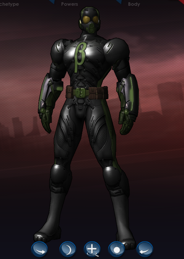
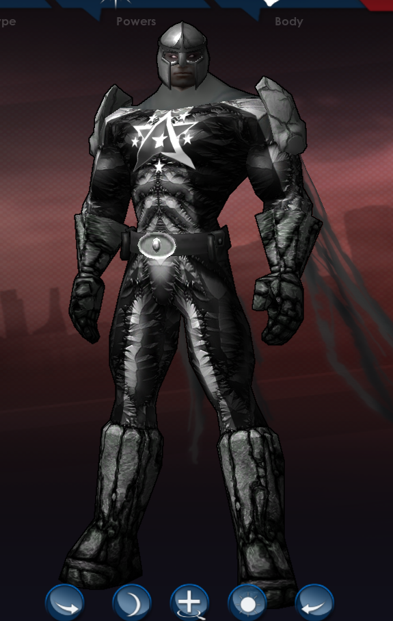
I don't know, I think that color scheme in general can work, it's more a matter of figuring out the right hues and placement -- and in the case of what I did here, setting them against a nice neutral gray to avoid them clashing against one another. I tried to make him look like a military cyborg of sorts, or maybe some kind of infantry in a light exo-suit? I shamelessly stole @Shocktacular's chest detail idea because it's a good one. I solved the problem of the back looking a bit plain in a slightly different way. Beta.costume
-
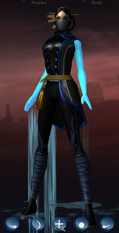
My first try. Might come back with others too. Not sure if this one says "Night Widow" or "Fortunata" more, so maybe there's room for a variation one way or the other. Keying off the name, I started with dark blue but wanted a "moonlight" glow to set things off a bit, so I went for the Celestial chest detail. Clicking through one at a time, I discovered that the lines of that piece flow really nicely with the Hearts pattern. Thus the Mesh legs pattern (I can't bring myself to use the Hearts legs pattern with the big ol' crotch-heart on it), which itself has a nice flow with the Fashion Tight boots as the seams running up the back of both line up near-perfectly. The Insect wings, Fairy Dust aura and big "bug eyes" goggles might be a bit on-the-nose, But hey, I had "Night" covered, those are the "Pixie" part. pixie.costume
-
If you think that name is good, you're going to be super jealous when you see the one I just snagged: (Costume courtesy of the "Random" button, because I care.)
-
Twinshot for scale.
-
It can be tricky working with a lot of colors, but thankfully "neutral" ones like black/white/grey make things a little less complicated because they don't tend to clash with anything. Gold is slightly less problematic too, since a lot of costume pieces have non-colorable gold accents (the hem/border at the bottom of the Patrician Toga, the pattern on the Praetoria Police chest armor, the buttons on the Victorian Steampunk corset, several Imperial Dynasty chest and leg patterns for women). In my experience, it's usually best to pick one or two "main" colors and one "accent" color, though any of those being a neutral one makes it more likely that you can work in something extra, so we're actually in good shape here with black and white plus two other colors. Unfortunately, the two-colors-per-thing limitation you mentioned means that accessories like chest and shoulder pieces are almost certainly going to be needed, if only to have somewhere to put all of those colors! Ultimately, I think this may be a case of having to settle for "similar to" rather than "actually a recreation of" -- and not just for ToS/copyright reasons. The character editor can only do what it can do, and we can only work within those limits. We can either lament not having a "spiderwebs" pattern or a "power ring" hand model, or we can look at what we do have and make something out of that. I managed to put this together, not exactly what you asked for, but based somewhat on the source character. Is it Captain Avalon? Absolutely not. Does it evoke a similar "feel"? I'd like to think so. Hope it helps! Avalon.costume
-
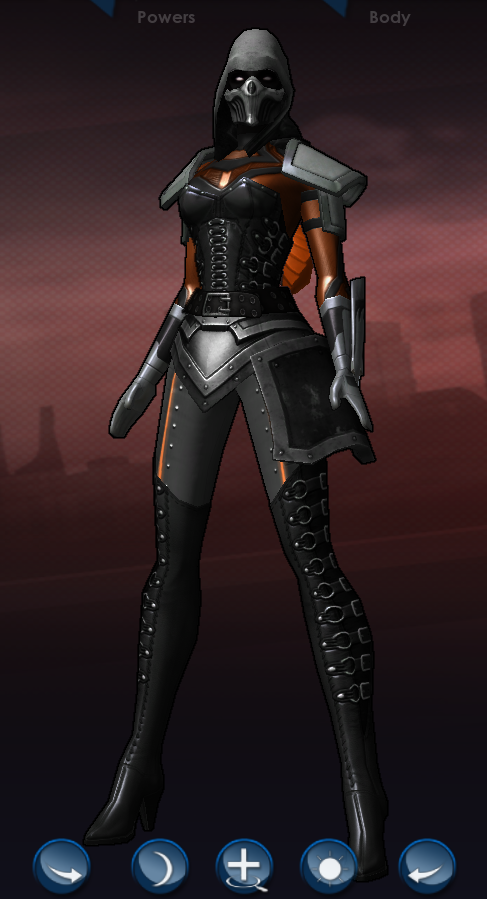
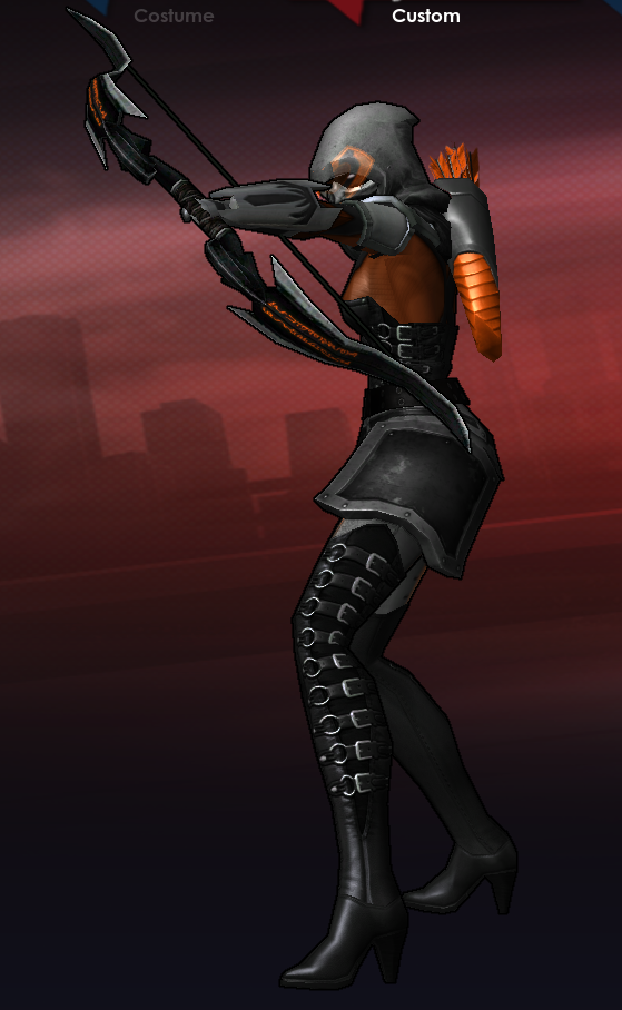
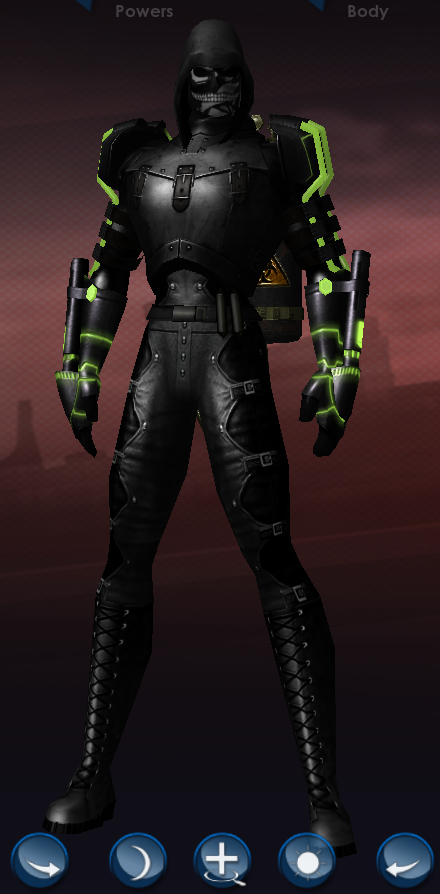
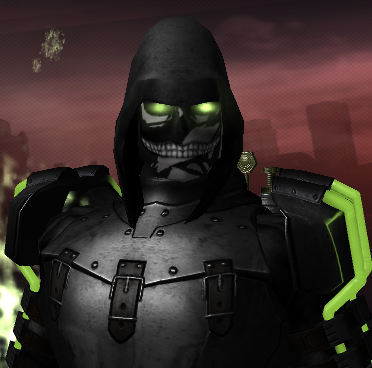
My attempt: With a name like that (plus name-dropping the Taskmaster), some kind of death/skull imagery was needed. I kept the corset but used a version with slightly more coverage; I wanted to make it look like a tactical/protective piece. Changed the chest texture underneath as a result. The asymmetry thing others are doing really works well for an archer. I armored up her left side more than her right because that's the side of her that's facing the enemy when she's firing at them (Justice gloves on both hands, one with plate, one without). Protect the side that needs it, but otherwise stay mobile for spinning kicks and the like. Shamelessly stolen from upthread: HUD + hood + eyes against a black background = badass, or at least that's what I was going for. MurDiddlyUrderer.costume
-
My e-e-evil new Fire/Earth dominator, the villainous Volcaniac!
- 8198 replies
-
- 23
-

-

-
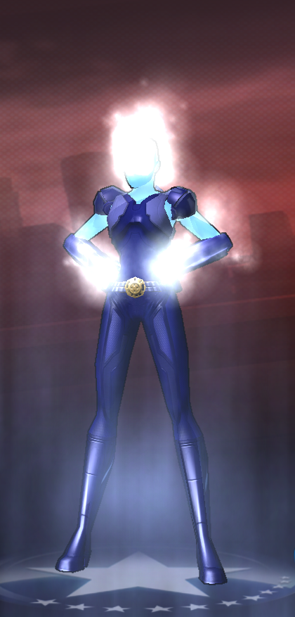
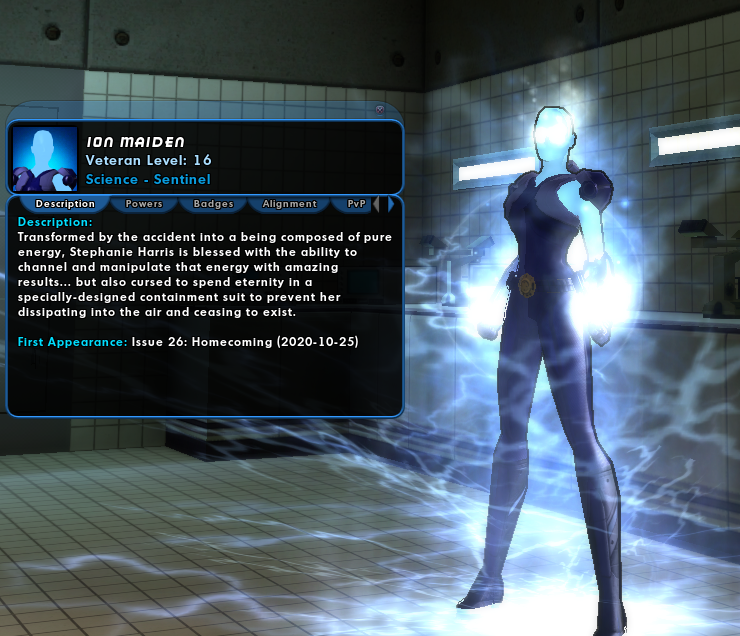
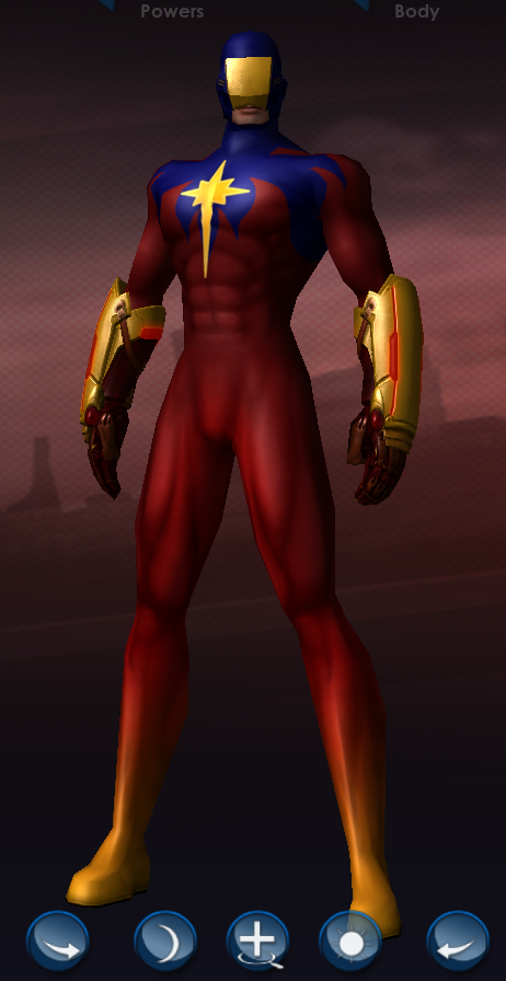
Thank you! I went back and forth for a long time on a lot if different parts of the look. It's hard to show off that she's composed of energy without also having her run around nude. I'm still not 100% sure about the shoulder pieces. As for a telepathic link, I think we're safe as long as we don't start finishing each others'...
-
Star Soul is great! The first shot looks a lot like one of my semi-mains, Ion Maiden.
-
I really like the face/head here. The glowing eyes coupled with the HUD aura against a black background create a really cool-looking effect.
-
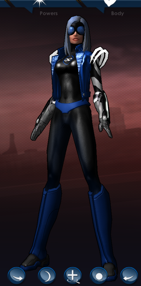
Like Shocktacular, for some reason my mind immediately went to something (mostly) black and white. Blue as an accent color because of the ice ancillary. Also, I had to use the the big glowing shoulder rings. "Teleport addict" made me think "adrenaline junkie," so I tried to pull off sort of an overall super-science-meets-extreme-sports vibe, thus the goggles, the open jacket (also to show off the Infinity symbol, because recursion), and the textured full-body suit. Recursive.costume
-
I took this idea in a very different direction based on the "living shard of Paragon" concept. What makes Paragon, Paragon? Yes, the people; yes, the heroes running around all over the place; but is there a physical feature that's unique to Paragon, that I can represent in the costume creator? (Basically I played back the "we need a symbol" scene from Ghostbusters 2 in my head.) Of course there is. Many, in fact. One of them is the first thing we see when we log in with a new character for the first time, assuming we skip the tutorial. We all gather in the shadow of one for costume contests. Positron and Valkyrie hang out at the foot of one so that new heroes know where to find them when they're in need. Improbably-huge statues of heroes who made the ultimate sacrifice for the people of their city are everywhere in Paragon. That led me here: a living statue of Paragon City's greatest and most well-known hero. I tried to keep him from looking too clean and prefect, to present something that looks like it's the city itself rising up to protect its inhabitants, Sort of a good-guy version of the Devouring Earth, rather than something created by a person intentionally -- though maybe it's a little of both, a partially-finished piece that came to life before it could be perfected. Is it the spirit of Statesman himself, knowing Paragon still needs him and refusing to cross over? Is he forever linked to the city on some existential level the same way Ghost Widow is linked to Arachnos? Is it all a big hoax, like the Reign of the Supermen? I don't know, that's for you to decide. stone-statesman.costume
-
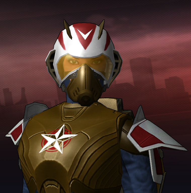
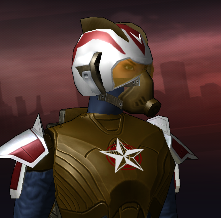
I really like this design. It's awesome! The brown, I think, works well. It gives the whole costume a utilitarian, 1930s test pilot/1940s military feel. Rocketeer-meets-Ultimate-Captain-America. Personally, I wouldn't change it. Regarding the helmet, though, I'm of a mind that it needs a little something. It being so smooth and white and perfect clashes with the "function first" look of the rest of the outfit. But it's easy to go too far with something like that and end up with a chaotic, busy mess. The area over her ears, especially, felt sort of blank, so I added Side Scoops as they look like they serve a purpose other than just decoration (what that purpose is I couldn't say, but a purpose nonetheless). The Fins detail on top is to add a little texture and make the overall cranium region a bit less eggy, and to provide height that keeps the scoops from widening the head and/or looking like big Ferengi ears, but without tacking on a lot of extra points and angles and other unnecessary distractions from the overall look. I literally altered nothing except adding those two things to the helmet. Great design! freeflier-fins.costume
-
Honestly, it's a really solid design already, if maybe a little dated. To me it feels like something that doesn't need an overhaul so much as just a few updates. I tried to move it from looking like the Atom to looking like Solar, Man of the Atom. Don't know if I accomplished that exactly -- a lot of things I tried reminded me more of the 1970s version of (Marvel's) Captain Marvel. I darkened up the blue to make the red and yellow stand out more. The larger, more "blank" faceplate to help sell the "dispassionate" descriptor. Similar-but-not-the-same gloves because these match the faceplate a little better in my opinion, and the glowy bits, while gimmicky, imply that there's a lot of heat built up inside. Like the glowing coils in a toaster. I would have liked to do something with his shoulders, but it just didn't work with the Claws chest pattern and I 'm a fan of the way that suggests flames without literally depicting them. That "not-fire fire" look led me to add the blends in the lower body to improve on that illusion, and the overall flow from his feet to the "flames" at the top meant a belt would just break it up, so no belt. The outline on that particular chest detail is strange and doesn't play well with certain patterns and/or color schemes. This was one of them, so I just used a lighter shade of yellow to highlight it instead of a contrasting outline. Hope it helps! inferno.costume
-
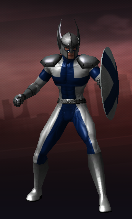
Well, the two-color flags like Finland are definitely easier to replicate than the three-color ones. I added armor plates so he looks like a warrior, but I stayed away from horns. Other affectations say "Viking," too! finland.costume
-
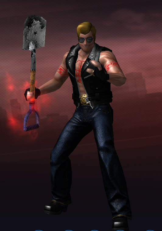
My take: I gave him a slightly more ridiculous "cool guy" haircut. The "Johnny" name makes me think of over-the-top characters like Johnny Bravo (the one from Cartoon Network, not the Brady Bunch) or Johnny Cage and I wanted to emphasize that silliness. More cool guy stuff: aviator shades, tribal armband tattoos -- but evil tribal armband tattoos -- stylish jeans, a big ol' belt buckle, and I kept the jacket style but made it a vest because c'mon bro, why cover up guns like these? As a nod to his dark secret, I added the Ghosts aura around his shovel in combat as the damned souls try in vain to escape their horrible fate. mcstyle.costume
-
Some great stuff here, thank you all! Nice! The boots here really work well for a Beasts MM, and I like the way they match with the gloves, and in turn the pads/plates on the gloves tie in with the Celtic pattern. The brighter, more silvery "moon" stands out well against the yellows in the rest of the design; that's definitely an improvement over mine. My favorite part might be the chains, though. They're a nice subtle touch that, again, works for a Beasts MM especially. Okay, first, the mask is brilliant. There's a lot of clever stuff here, like how I never would have thought to use the spiked gloves and boots on my own, but the mask especially is fantastic. The fur is a great thought, and I actually kind of wish there were more of it -- maybe the shoulder detail that wraps around the shoulders (the one from the bolero, though I think the whole bolero would be too much). I love that belt on almost any design; it's one of my favorite individual costume pieces in the game. Switching to a female character has an advantage I hadn't thought of before: the smaller torso, or more accurately the change in scales of both the circle emblem and the wolf detail to accommodate it, makes the "wolf on moon" chest design look more like a single cohesive image rather than one thing on top of another. Wow. WOW. I love this. The face is just wolf-y enough, and the respirator/snout/muzzle feels like it could be some piece of technology that channels sound, too -- it says "howl" specifically, rather than "animal that howls." I opened up the costume file to play around with it and found so many little touches I hadn't noticed at first: the asymmetric cape makes it look like the hood is a single long piece of cloth wrapped around his head. The use of true black on the hands and dark gray everywhere else emphasizes how beastly the claws look. The diamond blend pattern coupled with the round belt buckle makes it subtly suggest a full moon that's actually giving off light, but in that diffused, glowing-but-not-really-shining way the moon does. The more I look at this one, the more things I like about it.
-
A while ago I was checking names on Excelsior at random just to see what I could grab. I somehow I ended up snagging Howl. I had no plan for it, but I kept it, because of course I did. I mean, it's too good a name to not use, right? Unfortunately, that's pretty much the end of the story. I tried a few power combinations, mostly variations of sonic and dark (though now that I think about it a Beast/Sonic MM might be the way to go), and a few costumes, but nothing ever really clicked, and for me, an uninteresting costume is an uninteresting character is an uninterested player. I came up with something that looks okay, but it's not particularly special. So let's see what you can do. Here's where I am: Yes, yes, moving castle. Not really my thing. Also, it's "The Howl," not just "Howl." Wolf imagery is a plus. But I don't want an actual wolfman. I'm willing to change anything about the character, including gender, alignment, origin, AT or powersets (currently he's a blueside magic Sonic/Dark sentinel) if it fits better with a design I'm into. This one's kind of a free-for-all, as long as it makes sense with the name. My favorite parts of the existing design are the way the Beastly Rage aura looks combined with the goggles (it pulses!), and that the wolf's head is superimposed over a "full moon" on his chest. These are by no means deal-breakers, though. If you want to ditch those elements, ditch them! My least-favorite part of it is that the head overall evokes more of a "bug" or "fish" reaction than a wolf. I'm not sure what I was thinking with that lower-face detail. Is it a muzzle? is it supposed to look like some kind of speaker or amplifier over his mouth? Are the swept-back points meant to be ears? I have no idea. Let's see what you've got, Request Thread!
-
Obviously it depends quite a bit on what the person doing the asking is looking for, and how particular they are. But in general I think it helps to have a starting point and a clear mission. "Here, do whatever" is more freedom, sure, but it's also extremely vague. At the very least I'd like to know a character's general "deal" -- name, powers, theme, alignment. But if there's an existing look I can use as a basis? Even better, sometimes that by itself can provide inspiration. Better still, show me the existing look and tell me what you like and don't like about it, what you're trying to do with it that isn't working. There's "fix my car," and there's "fix the weird noise my engine is making," and there's "the engine makes a knocking sound every time I change gears, fix that."
-
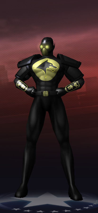
Oh, this is a fun one! I don't know how his powers are colored, but when I think "fear gas," the image in my mind is kind of a sickly yellow-green color. So I kept the tanks and tubes as requested, but colored them to match that. And then I purposely used drab colors on the rest of the design, so that his gas-distribution system is sort of a visual focal point. I made him thinner, because, well, the Scarecrow. I like the "grinning terror" aspect of the original design's face/head, so I played with it a little and came up with this. Still sort of a jack-o'-lantern, but also sort of the Grim Reaper and also sort of a clown -- terror incarnate. Screenshots won't do it justice, but I'm particularly a fan of the aura -- Volcanic eyes are pure nightmare fuel when seen in motion. It's there in the costume file, I just set it to "combat" so I could get a clear shot of the costume itself -- load it up and see what he really looks like. Speaking of auras, the costume file also includes a cloud of fear gas as a path aura, depending on your tastes. Personally, I like it, but again, didn't want it to obscure the costume-costume so I turned it off for the screenshot. If you're not a fan, Roaches might be a solid choice instead -- bugs are scary too! I played with the idea of a gas mask or respirator, but one, it would have covered his face, and two, I like the idea that he breathes in his own stuff like it's no big deal. "Yeah, fear gas, hallucinations, so what, welcome to my world." The Ampules belt on the original evoked the idea that maybe he's got an antidote or something in those little pods just in case, so I kept that, but switched over to the Resistance belt because it only had two of them. Why carry that many around, that's just asking for your enemies to use them against you. Black Knight chest piece because I tried various straps and belts to look like they were holding up the backpack, but it all ended up a little too chaotic and messy with the Buckled Leather pattern; this way the tanks aren't just glued to his back, but things are a little cleaner visually. That the always-kinda-brown straps on that match up nicely with the always-kinda-brown straps on the Resistance shoulders and belt is unintentional, but I'm not going to complain. NightmareFuel.costume
-
I find it's always best to opt for "inspired by" rather than "literally a recreation of." Not only is it safer from a copyright/generic-ing standpoint, it allows you to get creative and figure out what's going to look good in City of Heroes without worrying about whether any particular detail is "correct" or "accurate." Plus the whole point of a character-creation system in a game is is to use it to create your own character. Make a Claws/Regen scrapper with a shadowy past and an attitude problem, but don't try to actually make Wolverine. Make a spunky blonde teenager who's super-strong and hunts supernatural monsters, but don't worry about matching Buffy the Vampire Slayer exactly. In this case, "water-manipulating martial artist who uses her powers to replace the arms she lost" is a great starting point, but that's all it needs to be, and probably all it should be. With all that said, here's what I was able to build on that foundation. I tried to take the general concept and fit it into the game's context of "modern American city where superheroes are totally a thing." There's still a definite Chinese flavor to the design, obviously, but I think it fits into Paragon City rather than feeling like it was plucked from some other universe. Maybe she's tied to the Tsoo somehow? I used the Spectrum chest and gloves (plus the Slime aura) to try for a watery look on the arms, and I think I mostly achieved it. The main issue I ran into was that all of the robes we have sport a neckline that doesn't completely cover the upper torso, so the "water" showed through at the character's throat. I remedied that (to a point) with a mask even though Ming-Hua doesn't wear one, and added the Spiked Collar that's hidden under "shoulders" (never could figure that one out) which together almost do the job if I camouflage the collar by coloring it the same way as the robe. The way that the gap keeps disappearing and reappearing when she breathes bugs me in the character editor, but in-game is should look fine. waterbender.costume