Flashtoo
-
Posts
401 -
Joined
-
Last visited
Content Type
Profiles
Forums
Events
Store
Articles
Patch Notes
Everything posted by Flashtoo
-

Focused Feedback: New Costume Additions & Fixes
Flashtoo replied to The Curator's topic in [Open Beta] Focused Feedback
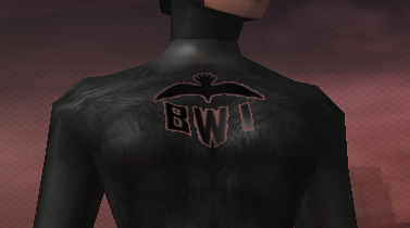
Request: Any chance we could get a version of the Seer belt where the secondary color changes the color of the light? Currently the secondary color doesn't do anything. Bug report: Blackwing chest emblem has some transparency issues with certain tops, looks like a z-buffer problem. Screenshot and list of tops where this issue occurs below. (Pictured: Animal Fur) List of tops that display the issue - categories that are not listed such as Jackets and Bolero where the top pattern is available underneath still display the problem but are omitted for the sake of brevity: Shared: Bodysuit Armored Bodysuit Leather Bodysuit Muscled Gloss Bodysuit Muscled Matte Bodysuit Padded Alpha Animal Fur Armored Pads Armor Plate Bioluminescence Chainmail Shiny Chainmail Dull Chaos Leather Circle of Thorns Clockwork Rusted Clockwork Defense Enforcer ExoProto Insectoid Jester Justice Leather Armor Metallic Metallic 2 Metallic 3 Monstrous Fur Mummified Olympian Guard Omega Onomichi Warrior Overguard Organic Armor Plant Reptilian Sinister Stealth Techbot Tech Sleek Ulterior Valkyrie Vanguard Witch Leather Awakened (All versions) Celestial Armor Fire and Ice 1 Fire and Ice 2 Spectrum Armored->Retro SciFi (All versions) Armored->Tech Knight Male/Huge: Cybertech (All versions) Leather Straps Imperial Dynasty Tanker Tattooed Bare Chest Tattooed Tank Top Tattooed T-Shirt Tattooed Yakuza Yakuza 1 Glow Yakuza 2 Glow Zombie Female->Tight: Insectoid Hybrid Imperial Dynasty (All versions) Female->With Skin: Angelic Plus Barbarian Bridal Bridal&Lace Cybertech (All versions) Imperial Dynasty Excess Plus Heart Plus Tank Top Tattooed Tank Top Witch Bare Witch Lace Zombie Talons Talons 01 Metallic Dress Top Yakuza 1 Glow Yakuza 2 Glow Labeaux 1 Labeaux 2 I have seen this problem before and remember solving it with a modded version of the chest emblem texture, using the old version of PiggViewer to do the conversion from .dds to .texture format instead of newer texture tools.
-
From a Night Ward overworld spawn.
-
- 1
-

-
Wow, what a fast response! Thank you so much! Unsurprising that it's multiple color values that need adjusting.
-
Flashtoo's Graphic Mod Compendium
Flashtoo replied to Flashtoo's topic in Tools, Utilities & Downloads
Well I actually made something new. Install the Office Plant Upgrade using Michiyo's neat little app. Re above texture glitch: Sorry I didn't see that when it was posted. Was it ever fixed? If not I can try to look into it... -
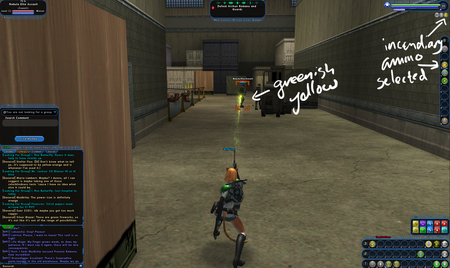
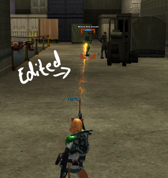
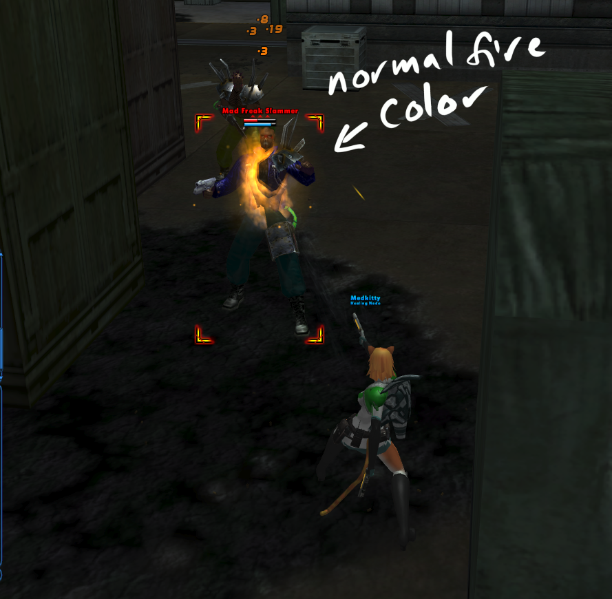
I believe this but at this time, the color of the fire they emit is so greenish in color that at first when I made my Pistol characters I kept getting confused about 'Wait, I meant to put in Incendiary, not Chemical.' Yellow is a fine fire color. I just think that for the sake of visual design, it'd be better for it to be a more school-bus yellow than lemon-lime yellow.
-
I am aware of this and intended to convey said awareness in my post, but apparently I'm bad at communication.
-
A fix that feels like it should've been addressed by Paragon Studios before the content was released back on Live but wasn't, due to late-released content being.. maybe a little rushed. Incendiary Ammo projectile particles do not match the color of the power icon or of the DoT particles that attach to enemies after they've been hit. Most people who aren't actually the ones playing the Dual Pistols character probably don't notice that anything's wrong since they just assume the Pistols guy is using Chemical Ammo, and even the Pistols player may not notice if they typically run on large teams where particle effects are easy to miss, but when soloing, the color discrepancy is obvious: Eyedropper tool brings back #FFFFxx yellow tones for the projectiles, i.e. exactly equal red and green content, which registers to the eye as greenish when it's darkened/attenuated even though it's technically the 'purest' kind of yellow. Compare to the default fire effects that have more red than green content, for an orangey tone. Unfortunately this isn't something I can patch clientside, since the projectiles use generic shared grayscale-image particle textures and if I nudged them to be more reddish to offset the greener aspect of the coloring, and doing so would stain every other usage of those particle textures more red than they should be, so it has to be done by changing the particle FX color values serverside. So, how to fix this? Two possibilities: Unlock color customization for Dual Pistols. This is IMO the less desirable option, because of the difficulty in implementing it in a satisfactory way. This option would entail either: 1) Color customization only applying to the Incendiary Ammo, which presently isn't even viewable in the tailor (only default ammo is), 2) Color customization applying to all types of ammo with the same colors, which is disappointing and counterproductive for people who want all their ammo types to be distinct from each other (in particular Incendiary and Chemical), or 3) The dev team diving deep into the UI to not only introduce the unprecedented ability to swap powers between "modes" within the tailor interface but to allow three or even four (if you count the default ammo) separate color customizations for every power in a set, which would be amazing and cool and ideal for the players but seems extremely unlikely to happen. Alternatively, Change the color values for the Incendiary Ammo projectile particles to a more orangey yellow. This option gets my vote because it'd be much easier for our dev team to actually implement. Below, a mockup of what the projectile color for Incendiary Ammo probaly should look more like, globally - I did my best but of course there's only so accurate you can be when changing a 2D image of fuzzy 3D particle systems: I really doubt that this would piss anyone off, because the people I talked to about it when I have brought up the subject can be divided into two camps, which are "Yes, I agree, I hate that it's green, it should be orange" from the people who play with Pistols a lot and "What, isn't it orange already?" from the people who never paid that much attention. Camp A gets what they want with this change, and Camp B doesn't even notice a difference. Net gain. Thoughts? Fix please? This seriously drives me nuts and it's not just me.
- 11 replies
-
- 11
-
-

-
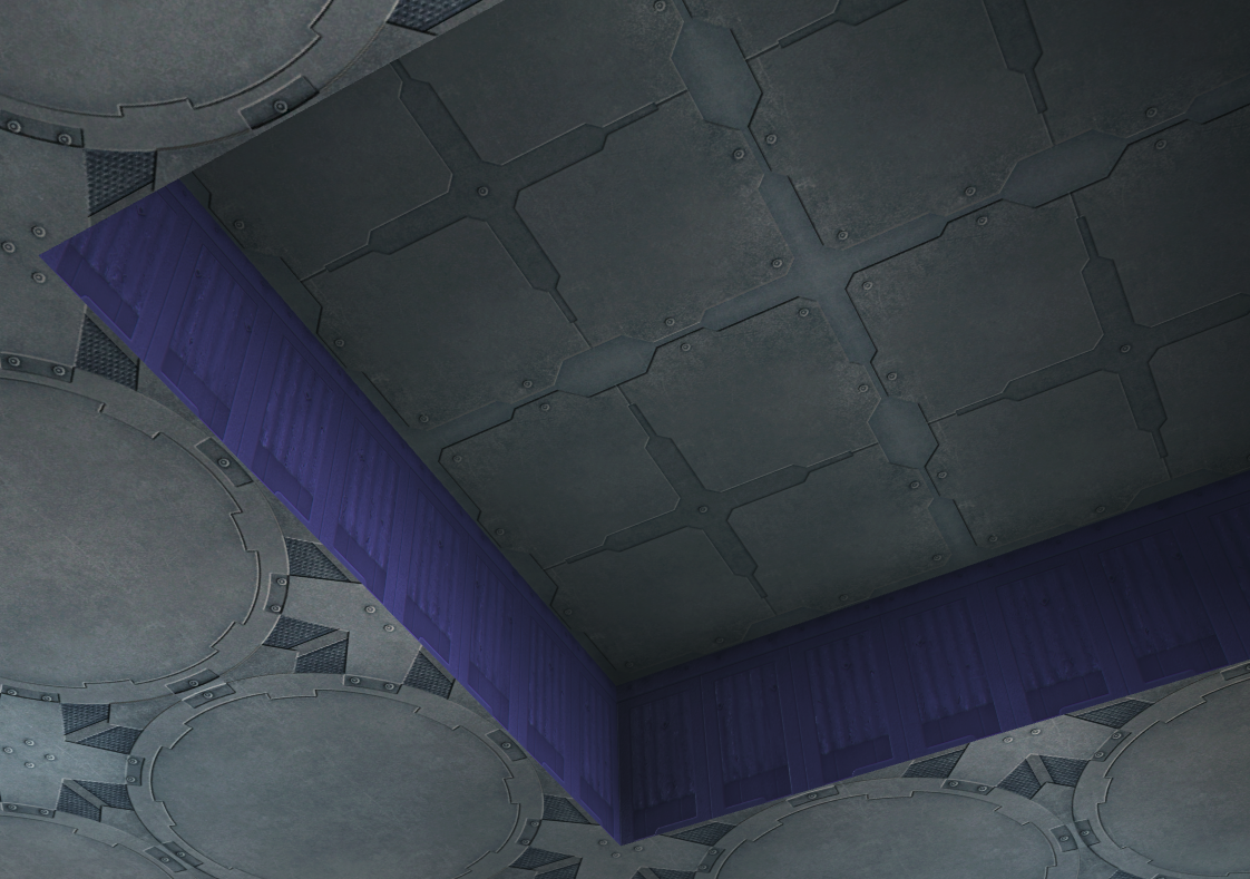
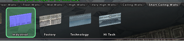
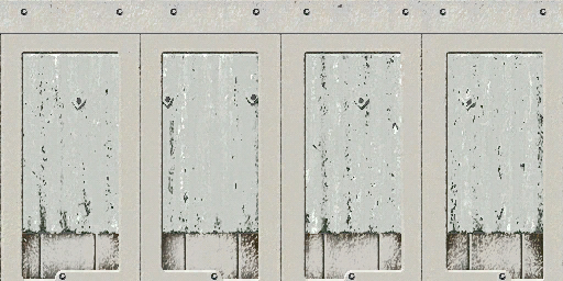
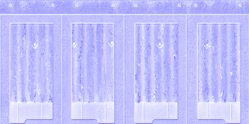
I'm not sure how this went so long without being reported/corrected, probably the bystander effect, maybe just that nobody's dug up the relevant file paths before. But anyway it's getting properly reported, in detail, now: The "Industrial" style option in the Short Ceiling Walls category shows up purple instead of its intended color because the game is calling the bump map instead of the diffuse map, as shown in these screenshots. This is definitely not intentional. I have done some digging in the game files, and the correct diffuse texture does exist, it's just being replaced by the wrong one. The path for the correct texture, the diffuse map, is texture_library/WORLD/V_CoV/Bases/Bases_stlfac02/bases_stfac02_upper_wall_40_master.texture, but the ingame model displays the bump map, texture_library/WORLD/V_CoV/Bases/Bases_stlfac02/bases_stfac02_upper_wall_40_master_bump.texture instead. I cannot tell if the two have been completely transposed and the diffuse map is being called as a bump map too, or if the bump map is mistakenly doing double duty. Adding custom colors works correctly, but it retains a purple cast to whatever colors are added. It'd be nice to actually be able to use this texture in bases without an unintended mandatory purple tint.
-
Day/night cycle control for bases, is it possible?
Flashtoo posted a topic in Suggestions & Feedback
With October and its eternal night upon us, it got me to wondering. Is it possible to program in a setting for supergroup bases that halts the progression of the day/night cycle in the whole base, so it could be set to "active (default)," "day only," or "night only?" I am aware that there are a few sky options that already lack this cycle, but: -The only "day only" skies are the Lighted Path and Cimerora skies, which are not normal-looking (even Cimerora has a gold/sepia tone instead of blue), -The "Space" sky is a good normal-looking night-only sky, but it would be good to have more variety available, such as night skies with visible clouds, -Some of the existing always-night skies still use the day/night cycle timer to spawn meteor showers or not and having a day/night control would then allow you to set those to always-on or always-off, -Even with the non-cycling sky options, certain placeable objects still follow a cycle of lights-on/lights-off and I, for one, would like to be able to halt that if my sky isn't changing I'm aware that the code for the base editor is a horrible snarl and this may not be possible to program in, but if it were, that'd be freakin sweet. -
Tempest's Roleplay Suggestion Compendium
Flashtoo replied to GM Tempest's topic in Suggestions & Feedback
Bring back Echo Zone beacons for bases. I would have argued against their removal if I'd known it was coming, but prior to their removal, I've been in several bases that used them for concept reasons. I do not believe that their existence made it appreciably easier to get an Ouroboros portal than it is now (it's just as trivially easy to ask someone to drop one for you as it is to set up a simple base with Echo beacons in it) so removing them in the name of making the Entrusted With The Secret badge easier to get was ultimately pointless, and did nothing but break a bunch of supergroup base concepts that were using them for RP-centric purposes like memory crystals, holodecks, and magic history books. -
They're horns, tilted with advanced posing and clipped through the face just a smidge. Sorry, no, I'm right. There is nothing in these images that is connected to Homecoming in particular or any rogue server any more than to City of Heroes back when it was live, any more than literally any piece of fan art could be. The few characters that are unique to Homecoming, such as those from the new Vazhilok/Freakshow content, are absent from my work here and will not be made.
-
Ditto. And now, Penny Yin.
-
I understand the concern, but I'm not worried. There is nothing here that could possibly get Homecoming in trouble - I do not represent the Homecoming team, I am not suggesting these miniatures be used as assets for Homecoming, and there is nothing present in any of these miniatures that is somehow specific to Homecoming in particular rather than just City of Heroes at large - we're only one of several rogue servers out there. Any reference images I used were from ParagonWiki or Google Image Search. As far as anyone at all is concerned, I'm just sharing City of Heroes content on a City of Heroes forum. As for me, personally, getting into trouble: People post copyrighted characters on r/HeroForgeMinis all the time and they even have a flair for it. It happens, and this is a drop in the ocean. I don't intend to try and purchase any of these figures, so I doubt Sky Castle Studios will take notice. Anyway, here's Ghost Widow.
-
I've lately gotten really, really into making miniature designs on HeroForge, and over the past few days I decided to make a whole bunch of CoH NPCs... Got a bunch of minis of characters belonging to friends and sgmates and me too but not enough screenshots to put next to them for reference, so I'll show those later.
- 14 replies
-
- 14
-
-

-
Hi yes, I can give a more detailed explanation. Basically there are three kinds of NPC costume parts: 1. The ones that will fit on character models as they are. Almost any kind of skintight thing is this, such as the metallic ripped-up dental floss costume that CoT Succubi wear, as well as textures that go on parts that are the same shape as what PCs get, such as the boot texture the Carnival Strongmen wear. Some items in this category, like the Carnival Ring Mistress's bandeau tops, would have only limited coloring functionality, because of being more than two colors (including skin color), but could still be used despite that. There are also a few parts like the Carnival Harlequins' tall boots and Lamashtu's skull bikini that have unique geometry but still fit on PC models. 2. The ones that sort of fit on PC models, but need editing at the geometry level. These are parts that are assigned to the 'wrong' body slot for PC use, like the Menders' belts and shoulder details, which the game treats as a single item instead of several independent ones. To make these usable by PCs, someone would have to edit the geometry to cut it apart into several pieces and assign them to the correct body slots. There are also some NPC faces like the ones on the PPD detectives that don't fit on the PC head models because they're a half-face texture that gets mirrored symmetrically, whereas PC face textures are full faces with asymmetrical details like beauty marks and scars. Making these NPC faces available to PCs would require manually mirroring the textures with themselves to create PC versions. Most costume parts that involve 'cape systems' are this and we're unlikely to get them because they're highly resource intensive to render. 3. The ones that don't fit on PC models at all. Desdemona and Penny Yin are good examples of costumes with this property - their legs and feet are custom-shaped, and trying to fit their boots onto PCs creates gaps and horrific clipping. Another example is the puffy-sleeved shirts with bows at the back that the Carnival Attendants and Seneschals wear - these are fused with the chest, unlike the 3D shirts that PCs get, and can't be used with the way PC costumes are set up.
-
The only way to do this is to build that room outside/above the base plot instead of inside it and place "item" walls yourself instead of using the actual base walls- if you've already built the rest of your base, you can accomplish this by making the room accessible by teleporter instead of just walking in.
-
Great name and great use of the tire costume parts 😄
-
Bugs the hell out of me as well. The problem is that the Flex animation isn't put together to accommodate a shield and therefore it defaults back to the original chest-pound - therefore the way to fix it would be to make a new "Flex animation with shield" animation for it though and I don't know how easy that'll be.
-
What needs to exist to address this issue is the addition of a "Tattooed Short Sleeves" part for Jackets. The upper arm geometry is part of the Jacket Sleeve part in this costume top category, rather than part of the Chest part as it usually is.
-
I'm not hugely up on my Praetorian lore (though I should be better about it, seeing as one of my own characters is a Praetorian Carnie). That said, the concept of a Seer gone rogue because of DE contamination is entirely plausible - the contamination and subsequent influence from Hamidon might be itself enough to overpower Mother's hold. While this would still point at a Science (representing the DE alterations to the character) or Mutation (representing the innate psychic powers that would bring her into the Seer program in the first place) origin, it is in my mind the simplest and most sensible way to play things. Perhaps it's some Magic phenomenon that gave her back her free will.
-
The MacGyver Manual, or "You used X to make Y?!?"
Flashtoo replied to Raevyn_Darke's topic in Base Construction
That is one awesome-looking wardrobe. -
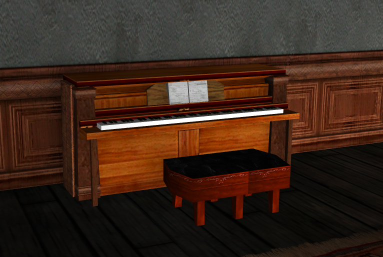
The MacGyver Manual, or "You used X to make Y?!?"
Flashtoo replied to Raevyn_Darke's topic in Base Construction
I've seen a few grand pianos made of alphabet letters, but here's my upright: three mission-style counters overlapped with each other, some short wall pieces to cover the flickering, a few stair rail posts, and a keyboard made presumably the same way as the grands I've seen out of modern picture frames and knife handles.
-
Oh, I like the colored labels indicating hazard zones, that's neat.
-
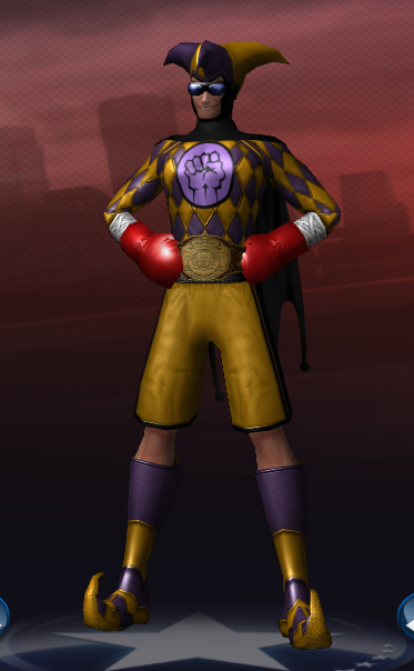
Gosh, he sure does look a lot like my own Punchline.
-
Screencapped: This happens with both Labeaux 1 and Labeaux 2 for the Robotic Arm 1 and Robotic Arm 3 top categories.