The Beta Account Center is temporarily unavailable
×
Double XP is active on all shards
-
Posts
284 -
Joined
-
Last visited
-
Days Won
2
Content Type
Profiles
Forums
Events
Store
Articles
Patch Notes
Everything posted by Lockely
-

AE: More, If Not All, Group Level Scaling To 50?
Lockely replied to darkwolf's topic in Suggestions & Feedback
Other servers have done this for AE specifically and the implementation is kinda janky even though it works. Homecoming seems to wish to avoid adding additional jank into the game, so our only real hope for this is for one of the devs to take this on as a pet project and spruce up the missing levels for these other enemy groups over time. Absolutely true, but that doesn't mean you should stop telling stories about them. I'm working on a Praetoria mission right now and I'm stuck with everything being 1-24 because that's when base level Praetoria content stops. It's really hard to make mechanically engaging content for places and groups when you're stuck level-locked before you even get an ancillary power pool. -
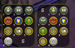
I find the Naga tray absolutely perfect for MMs who want a quick reference to their numpad keybinds, simply because it is reverse with the tray number below. Naga on the left, normal tray on the right with the same config. It's just so much neater.
-
I swear those little guys have a taunt. I'll send my MM pets in guns blazing, aoe web grenade down, me dropping a big ball of energy and like three enemies will snap to my tiny clockwork and evaporate it just for existing.
-
-
- 1
-

-
With the new Arsenal Control/Arsenal Assault sets coming, I thought it might be neat to create a Gold Bricker style character, however their weapons are Sonic based. No problem, I thought, Sonic Assault is an option, but all the current abilities for it animate/visually from the character's head. Since the Gold Brickers do have Sonic Guns, would it be possible to re-use their animations for an alternate animation set for Sonic Assault? This could also help eliminate weapon redraw for people using it with the Arsenal sets.
-
I usually write something small out to fit with my character concepts, but this gave me an opportunity to refine them with the most recent stories I've written for them. A small handful: Lockely - Vigilante, Bots/FF MM: Clocke - Villain, War Mace/Shield Def Brute The Auric Bombardier - Hero, Arsenal Control/Sonic Dominator Belenia - Rogue, Beast/Trick Arrow MM
-
In Sirocco's Patron Mission, Rescue Wretch Server: Everlasting Zone/Mission: V_Longbow_Seabase_60_Layout_02 Position: [205.7 36.0 -383.1] One of the ambushes (?) popped up with the following:
-

Focused Feedback: New Player Experience (NPE) Improvements
Lockely replied to Booper's topic in [Open Beta] Focused Feedback
I agree that Praetoria offers a more interesting starting experience, but the fact of the matter is that it *is* a harder experience by far, in the same way that Redside is a little bit harder than Blueside. The map spawn points in Praetoria are better thought out, so you have a more even distribution of mobs, leading to less ability to sneak around and having to directly fight them. The enemy groups are more challenging, because they were developed at a time when Paragon Studios finally knew what it was doing and wasn't throwing spaghetti at the wall. It's a wonderful starting (1-30) experience... for players who already have existing characters and know how the game works. It's painfully difficult for people who don't yet, and they don't have the context either for the decision made at Rift Enclosure to know what they're getting into when it comes to choosing between Paragon City and the Rogue Isles at mid-levels. The GR starter experience was created specifically for veterans to have something new to do, and they tacked on a decent tutorial for new players who decided to choose it anyway. The new descriptions make sense. -
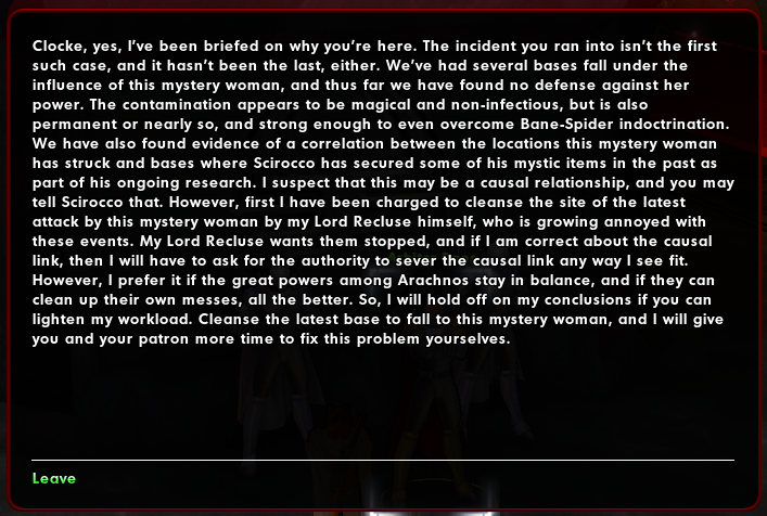
Not exactly a typo but I don't think this deserves its own thread and it is text related. Arbiter Daos in Sirocco's Patron Missions sincerely needs a couple line breaks in this massive wall of text.
-
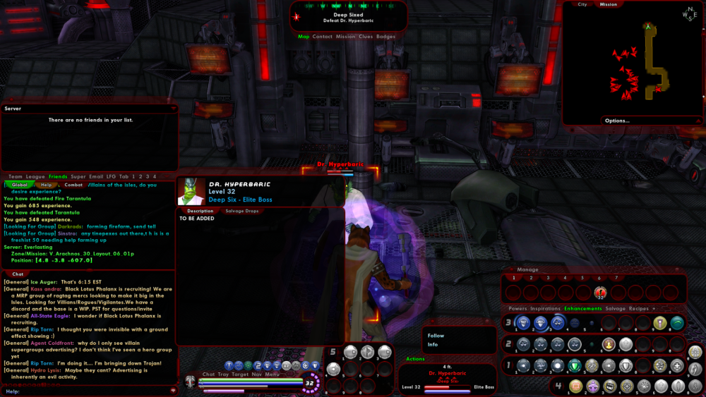
Server: Everlasting Zone/Mission: V_Arachnos_30_Layout_06_01p Position: [4.8 -3.8 -607.0] NPC: Dr. Hyperbaric Mission NPC is missing their description,
-

Focused Feedback: New Player Experience (NPE) Improvements
Lockely replied to Booper's topic in [Open Beta] Focused Feedback
This is definitely a UI scaling problem. I play 1920x1080 and I can click within any of the green sections on my tabs. -
There's nothing unique about CoH that necessitates having weirdly different movement or camera controls compared to the genre standard. The gameplay loop is what's unique, and that shouldn't change, but how you access that gameplay loop currently is a huge turn off for new players. I agree with your suggestion from the other thread, however, that a pop-up asking which style you want would be a decent option though!
-

Focused Feedback: New Player Experience (NPE) Improvements
Lockely replied to Booper's topic in [Open Beta] Focused Feedback
I think that's a very reasonable compromise! Should also have a "Remember this choice" options too. -

Focused Feedback: New Player Experience (NPE) Improvements
Lockely replied to Booper's topic in [Open Beta] Focused Feedback
Literally the first thing I have to do with any new player is spend an hour helping them tweak their camera and control settings to unfunk them from the CoH defaults. I came across a player who unintentionally managed to turn their camera to the side and then couldn't figure out 1) how they did it, and 2) how to fix it so they played through 7 levels of content looking behind them, because the binds are buried in a menu with a billion different options that aren't all intuitive for a modern audience. I'm an old player returning. Even I had to spend time fixing it rather than sticking with the oddity that CoH was even back in the day compared to it's peers. There's an argument to be made for historical preservation but the devs have given a legacy control scheme option for you to do just that. -
A crane is possessed in Cap Au Diable with incredibly unnatural movements, some kind of physics weighting must be messed up. Position: [-1470.7 -3.0 2184.1]
-

Focused Feedback: New Player Experience (NPE) Improvements
Lockely replied to Booper's topic in [Open Beta] Focused Feedback
The power tray slots using keybindings is literally gamechanging for me, and the modernization of the control scheme is going to prevent so much new-player fall-off from everything feeling "dated". Outstanding job for both!! -
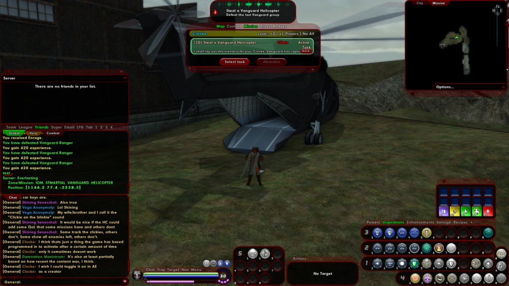
Mr. G's Steal a Vanguard Helicopter, once I defeated both enemies standing next to it, it input "text" into the system chatbox.
-
The popup contact introduction at level 30 Redside has a misplaced period. Wiseguy Badge has weird text at 30 too.
-
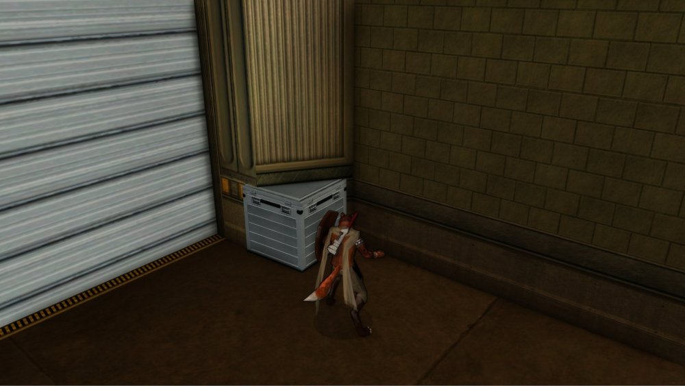
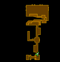
Server: Everlasting Zone/Mission: V_Warehouse_30_Layout_02 Position: [-138.1 0.0 -53.0] Floor glowie partially in a wall, if it was smaller it might not be visible.
-
-

Null the Gull Option: Set Gender for Badge Titles
Lockely replied to SilentSpy's topic in Suggestions & Feedback
This is an outstanding idea. Homecoming is already an inclusive community, so it would be great to carry it into the game as well. With all the NPCs who use custom gender-specific responses, it'd be nice for folks to ensure they feel 'seen' by their choices. And as others have said, some costume pieces work better on the opposite gender of your character, so this change benefits cisgender players and characters too by allowing you to simply pick how you want to be addressed. No muss, no fuss.
